
In today’s digital-first ecosystem, the most important representation of your business or organization is your website. All digital and non-digital channels your[...]

Filter Blog:

We recently updated a comprehensive digital marketing strategy guide to help business and marketing professionals learn how to create the best digital marketing[...]
%20Should%20Have%20These%20Capabilities-1.jpg?width=500&name=Content%20Management%20Systems%20(CMS)%20Should%20Have%20These%20Capabilities-1.jpg)
If your company has been around for any length of time, then you are most likely on your second, third, or even fourth version of your website. So, you may feel that[...]
I was chatting recently with members of the Orlando HUG (HubSpot User Group) at a workshop that we were having about content marketing. Most people that I talked to[...]

Much of your company’s success today, and in the future, will be determined by the effectiveness of your online digital marketing efforts. Therefore, it’s vital that[...]

Xcellimark Launches Custom MLS Real Estate Marketing Website System for Real Estate Agents & Brokers
Orlando digital marketing agency Xcellimark recently launched a robust custom MLS real estate marketing website system for real estate agents and brokers that[...]

Relatively small changes to your website design can have a big impact on your business’ ability to generate online leads, conversions and sales. That's why it's so[...]

Intuitive, conversion-optimized navigation is the cornerstone of great website design and development. In an increasingly competitive business landscape,[...]

It's difficult to overstate the importance of quality Web design. Even companies with great products and experienced management teams struggle in the face of poorly[...]

How often do you think about Web design? If you're like many business owners, you probably take a "leave it to the experts" approach to this highly visible but[...]

What's the measure of a great brand? Increasingly, brands are defined by how they appear online. Even if you don't directly sell anything online, it's critical to[...]
The Internet is becoming more image oriented, and Internet marketers and web designers need to keep up. This is the stark message coming from the search engines as[...]
When it comes to web design there are always new tricks to learn; however, what sometimes gets lost along the way is the importance of simplicity.
Google has updated its page layout algorithm, and web designers should take note. Over the last week site owners have been speculating about mysterious drops in[...]

Many business owners or marketing directors feel like they are failing when they are not getting meaningful business results through their website marketing efforts.[...]
Ask anybody about what is hot in web design this year and they are likely to mention responsive web design. If anything it is overdue, given how much popular means[...]
With new figures showing that mobile phones are now used by 91% of the world's population, with 50% of them using their mobiles as their primary source of internet[...]
Marketers panicked when a recent bug led to Google keywords becoming temporarily invisible; however, many searches are intentionally kept secret to the best of the[...]

Allison Sodha, the founding owner of Sodha Travel, approached Xcellimark about redesigning her website to accomplish several goals:

I have had the opportunity to be a part of the Internet industry since 1995 when I was the product manager for BellSouth.net, one of the first ISPs to be launched in[...]

In part one of this article, I shared why a great website design is not enough to help your business achieve its goals and went over some of the elements that you[...]

Great website design by itself no longer works. This announcement may come as a shock from a company that has won national web design awards for the last 5 years in[...]

Do you know what your visitors really want from your website? I can tell you. It’s not flashy, animated graphics. It’s not a talking video, unexplainably blaring[...]

A good website is made up of many components, but one that is often underutilized or even forgotten about is accessibility.
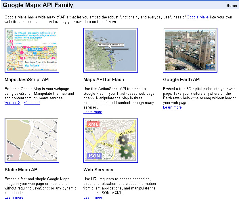.jpg?width=500&name=google_maps_api(1).jpg)
One of the most powerful map applications currently available, Google Maps, has revolutionized the way people find businesses and services or trace routes to[...]